
Body — Visual Pattern Library
Reference set for body sections — the middle of the funnel, between hero and CTA. Each entry pairs screenshots in this folder with the design rule they teach. The build engine reads these as "use this when" triggers, not as templates to copy. Match the pattern to the client's audience, content volume, and price point.
All files live flat in this folder. Filenames follow set-index-label — the set number groups a reference site, the index orders its screenshots, the label says what the page is.
Set 5 — Architecture & Construction Body System
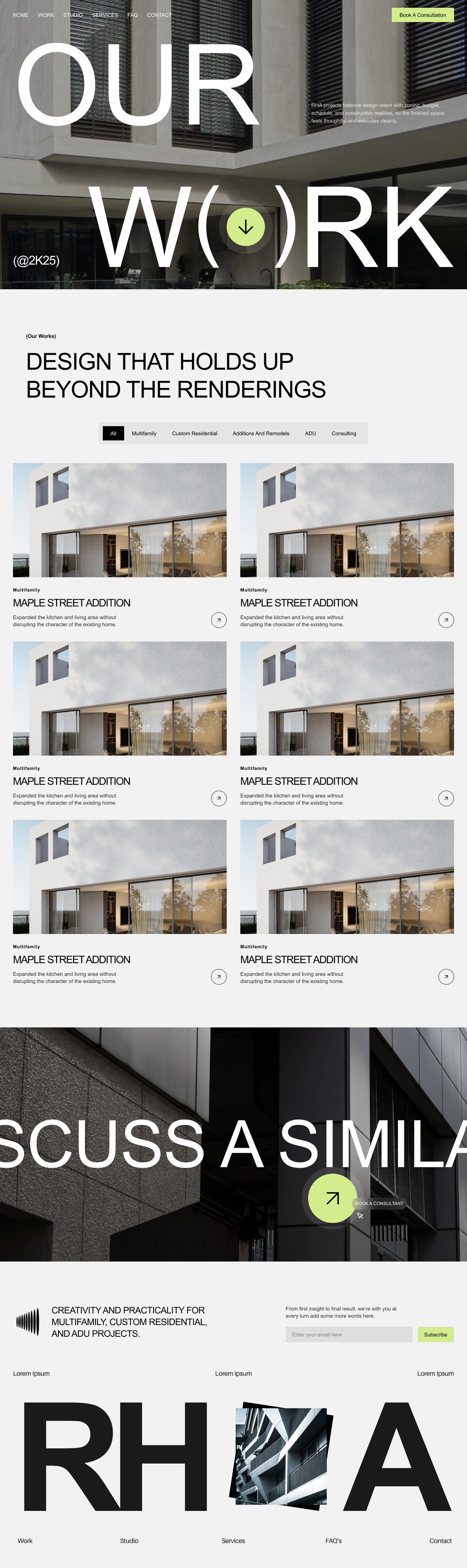
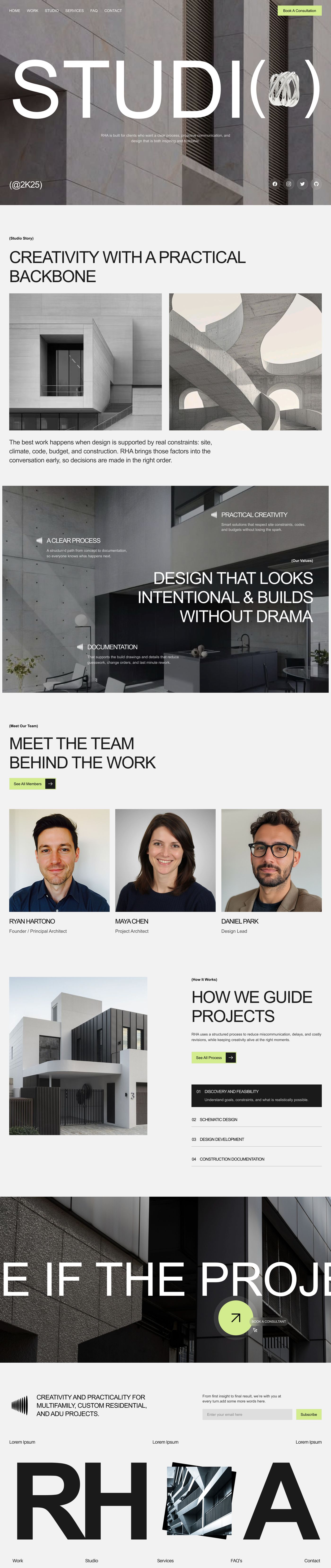
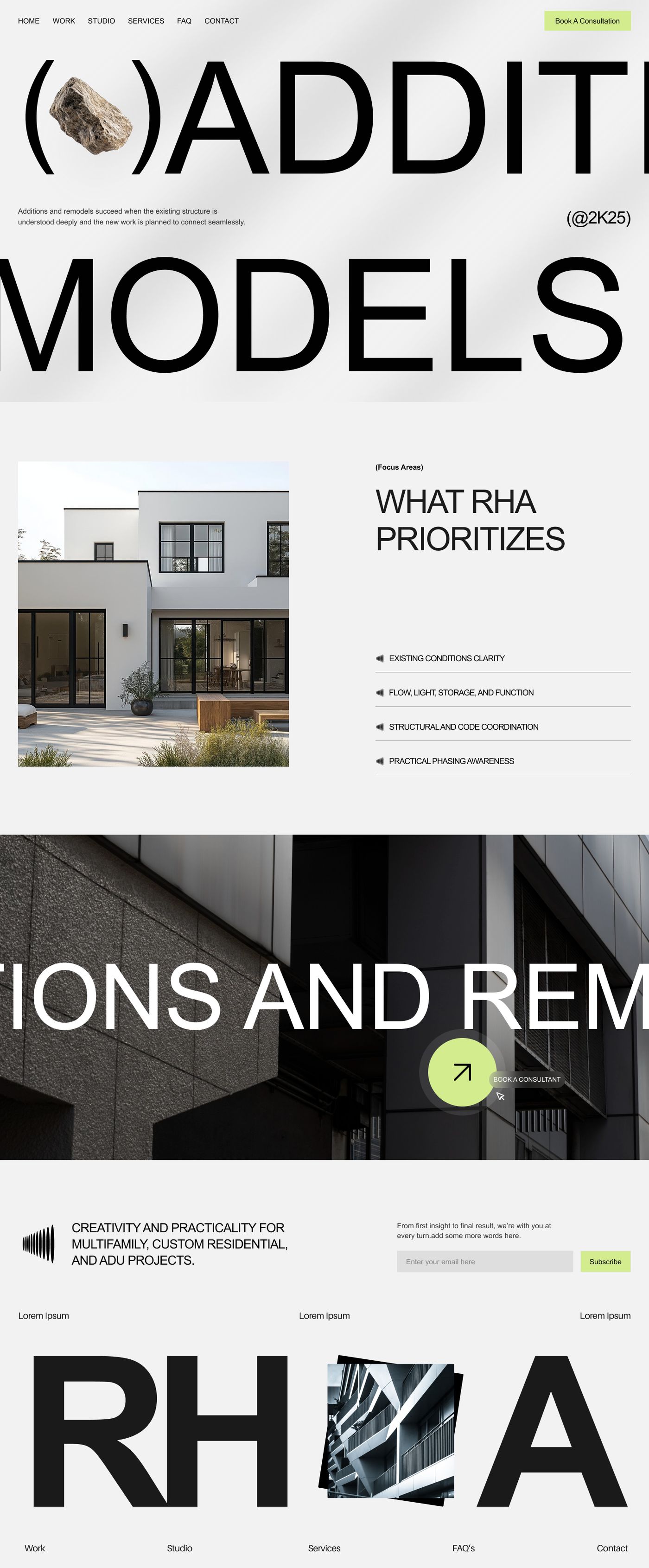
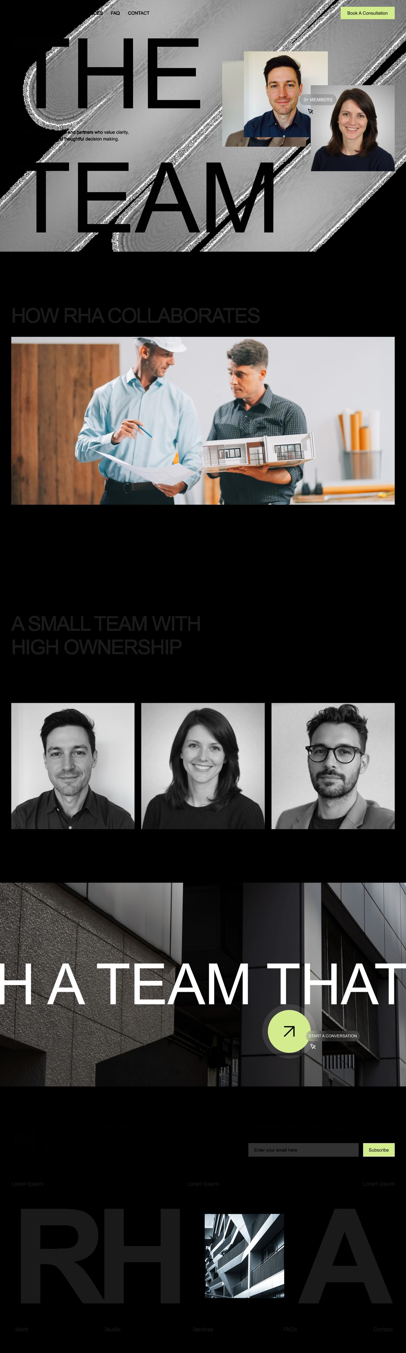
Reference: RHA — architecture studio (7-page set: 5-1-home, 5-2-home-alt, 5-3-work, 5-4-studio, 5-5-process, 5-6-services, 5-7-team)
Set 5 is not one section — it is a whole multi-page system, the reference for how a construction or architecture site composes its body. Clean lines, clean abstracts, disciplined black-and-white with a single acid-green accent.
Recurring devices across all seven pages:
- Monochrome palette — black, white, mid-greys — with one lime/acid-green accent
- Massive sans-serif display headlines, often cropped so the type bleeds off the
- A graphic object nested inside the headline's punctuation — an arrow inside the
- Parenthetical tag labels — "(Our Works)", "(Phase 1)", "(@2K25)" — small, mono,
- Numbered sequences — process phases 01–06, "How We Guide Projects" 01–04 — each
- Zig-zag image + text rows.
- Two-tone rhythm: light content sections broken by full-bleed dark architectural
- A large lime-green circular CTA button overlapping a dark building image, repeated
- A recurring giant "RHA" footer wordmark with an architectural image collaged
- B&W portrait grids for team; category filter tabs for the work grid; accordion
used only on CTAs and active states.
viewport edge.
parens of "W(↓)RK", a rock inside "(●)ADDITIONS", a ring inside "STUDI(○)", a camera inside "PRO(■)CESS". The page title becomes a logo-like artifact.
setting context above each block.
row a hairline-ruled list item.
photography interludes — the dark bands are the transitions, never hard cuts.
as the pre-footer on every page.
between the letters — the same close on every page ties the system together.
lists for FAQ and services.
Page-type coverage in the set: Home (5-1-home, plus the more refined variant 5-2-home-alt, which adds mixed serif-italic/sans headlines and a card-stack process module), Work (5-3-work), Studio (5-4-studio), Process (5-5-process), Services detail (5-6-services), Team (5-7-team).
Deploy when: architecture, construction, design studios, engineering, real estate development — any firm selling precision and process. The monochrome discipline plus oversized type reads as confident and editorial; the recurring footer wordmark and numbered sequences make a multi-page site feel like one deliberate system. Keep the accent to a single color — the restraint is the look.
Set 7 — Body-Layout Vocabulary Set
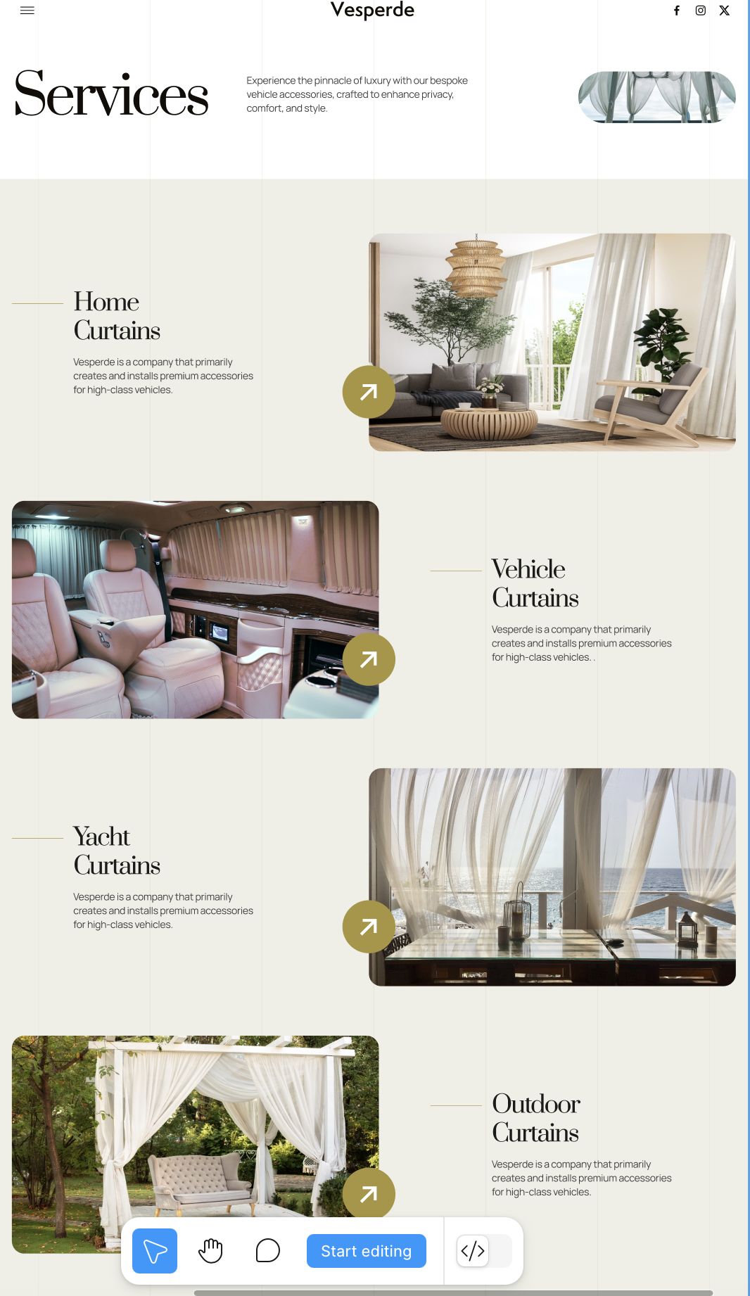
Reference: Vesperde — luxury vehicle curtains (5 screenshots, 7-1–7-5)
This is not one pattern — it is a vocabulary. Five ways to compose body sections inside a single, consistent visual system. They prove the same site can vary its section rhythm without ever feeling like different sites. Use them as a menu: pick the layout that fits each section's content, hold the system constant across all of them.
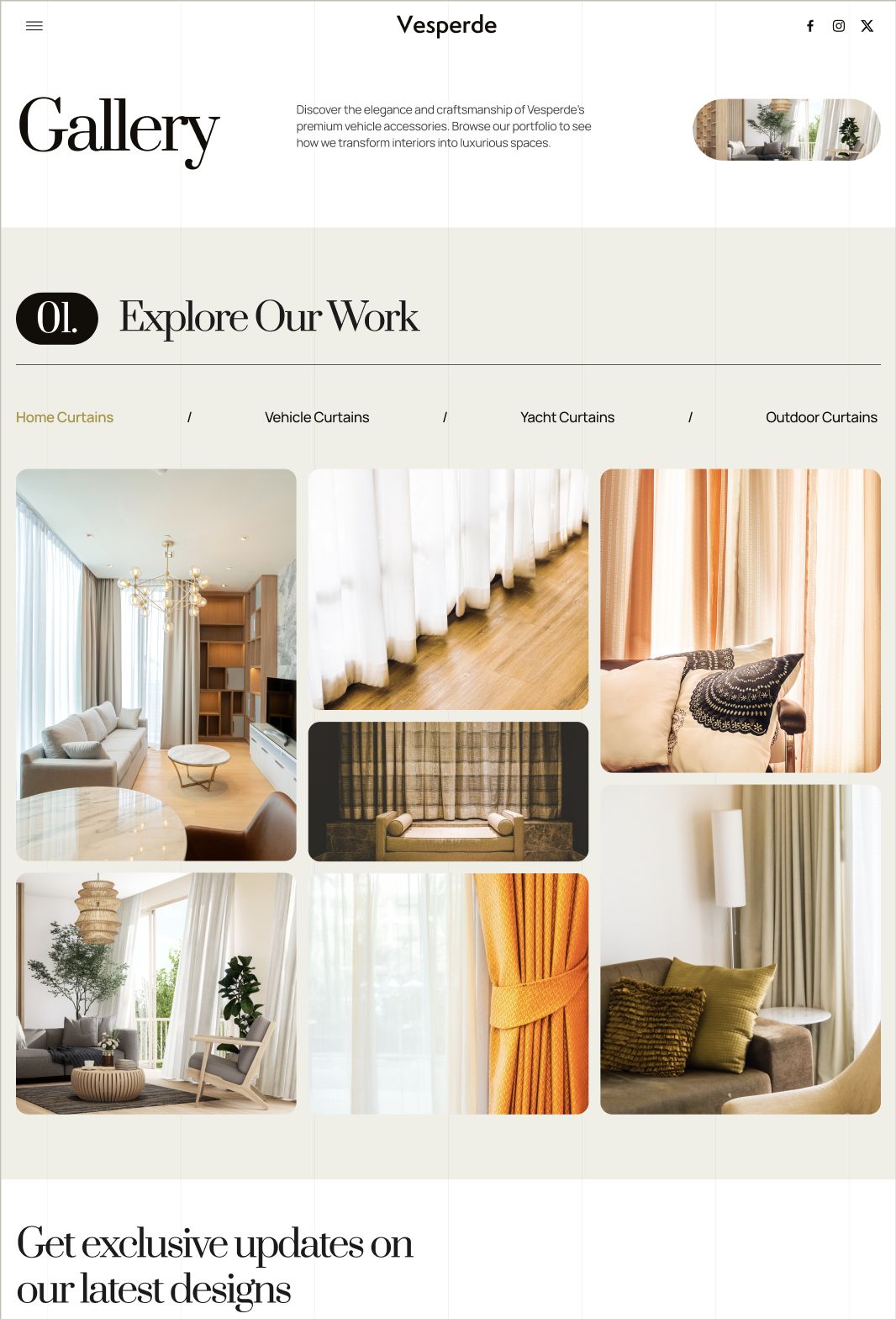
7-1 — Gallery bento with category tabs (7-1-gallery.png). A numbered section marker (01. in a black pill) sits beside a serif display heading. A row of category tabs sits under a hairline rule, active tab in the accent color. Below, an asymmetric bento grid of images at varied sizes and aspect ratios.
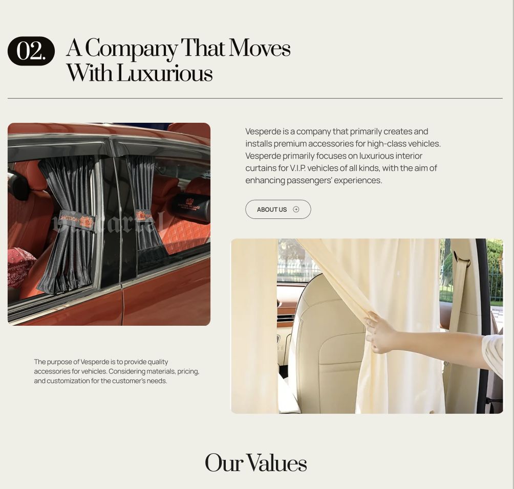
7-2 — Numbered two-up + text (7-2-company.png). Section marker 02. plus serif heading. Two images of unequal weight set against a paragraph block; one image carries rounded corners, faint ghost text bleeds behind it for depth.
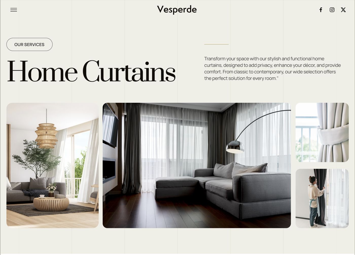
7-3 — Display heading + asymmetric image bento (7-3-home-curtains.png). An oversized serif heading ("Home Curtains") spans wide; copy sits to the side. Below, one large hero image flanked by two smaller stacked images — a 3-image asymmetric cluster.
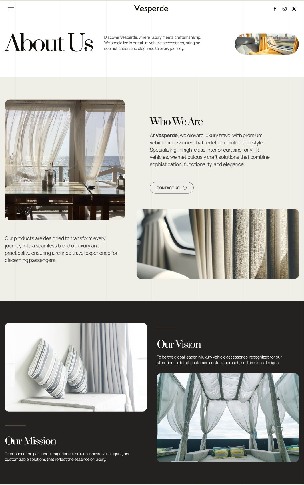
7-4 — Two-tone split (light → dark) (7-4-about.png). An About-style section that changes background mid-scroll: light cream above, near-black below. "Who We Are / Our Vision / Our Mission" laid out with images zig-zagged against text. The color shift is the section transition — never a hard cut.
7-5 — Zig-zag service rows (7-5-services.png). Alternating rows: image left / text right, then flipped. Each image carries a circular accent-colored arrow button that overlaps its corner. Serif headings, short repeating copy blocks.
Deploy when: any content-rich body that needs rhythm — services, galleries, about, process. Mix 2–3 of these per page. The constants that bind them: numbered section markers, serif display headings, asymmetric image groupings, hairline rules, one accent color used sparingly. Sections flow into each other; they never stack as identical boxes.
Set 8 — FAQ-into-Footer with Type-as-Graphic
Reference: La-Landing — e-commerce agency (8-1-team.png, 8-2-faq.png)
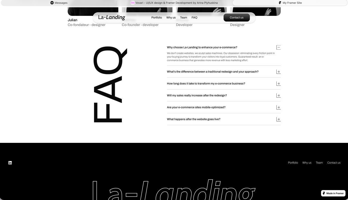
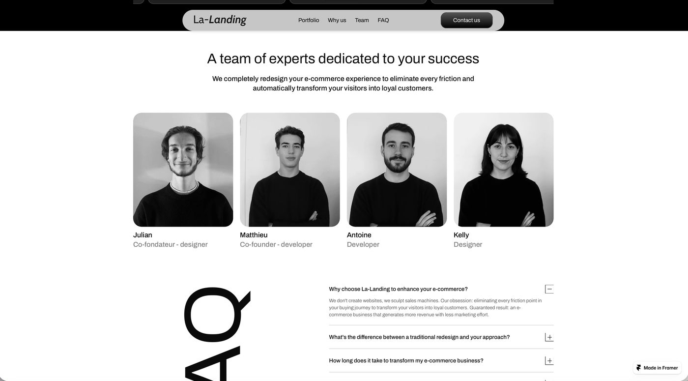
Two frames of one continuous flow. 8-1-team.png is the upper crop: a 4-up team grid of black-and-white portraits in rounded cards, each with a name and muted role label, under a centered headline. 8-2-faq.png is the lower crop: the FAQ section, where the word "FAQ" is set enormous as a solid graphic element on one side and the accordion list sits on the other (first item open by default). It runs straight into a black footer carrying a massive outline-only wordmark that bleeds off the bottom edge.
The signature: oversized typography used as furniture, not just text. "FAQ" and the footer wordmark are graphic objects. The whole run — team → FAQ → footer — is one uninterrupted black-and-white editorial sequence.
Deploy when: the end of the page needs to feel resolved and confident — agencies, studios, B2B services. Pairs the practical (team credibility, objection-handling FAQ) with a bold typographic close. Best for brands with a restrained mono palette where type can carry the drama.
Set 11 — Split Section: Media + Expandable Accordion
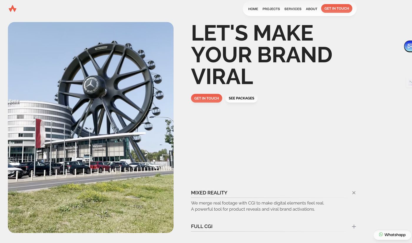
Reference: VFX / 3D motion agency — "Make your brand viral" (11.png)
A 50/50 body section. One half is a large media card with rounded corners (image or looping video). The other half stacks an oversized ultra-bold headline above an accordion list of offerings — each row expands in place to reveal a description paragraph, so the section stays compact until the visitor chooses to dig in. Light background, one accent color (red), two button styles (solid + ghost).
Deploy when: the brand has several services or features to explain and you want depth without length. The accordion lets one section do the work of five — the visitor controls how much they read. Good for service businesses and agencies where the offering needs explaining but the page must not sprawl.
Cross-pattern principles (apply to every body section above)
- Body sections carry the funnel's education job — inform without overwhelming.
- Sections flow into one another. Use color shifts, gradients, and shared motifs as
- Oversized typography can act as a graphic element, not only as copy — but only in
- Numbered section markers and serif display headings give a long body rhythm and a
- Whatever the hero established (radius, palette, type contrast) holds through every
Accordions, tabs, and progressive reveal let the visitor pace themselves.
transitions — never hard-cut from one boxed section to the next.
brands whose palette and restraint can carry it.
sense of progression.
body section without drift.