cta / _notes.md
Engine note: each entry is a CTA SECTION PATTERN, not a single screen.
Deploy = "use this CTA when...", not "copy this layout."
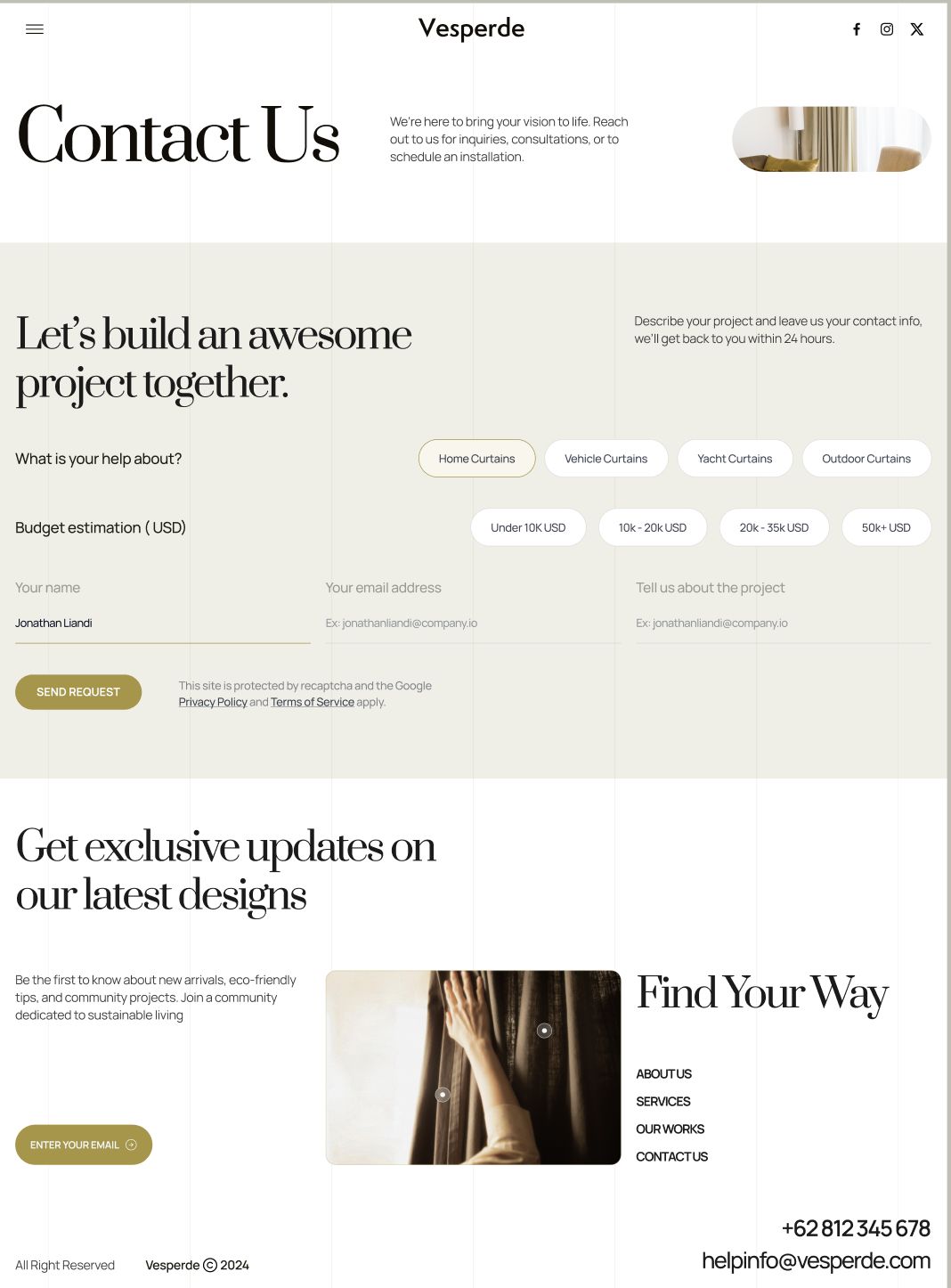
cta/vesperde/ — Qualifying-Selector Inquiry Form CTA (premium service / made-to-order)
Warm cream / off-white block, editorial serif display headline, single gold accent. The conversion ask is a project-inquiry form, not a plain email capture. Structure: oversized serif headline ("Let's build an awesome project together.") + short reassurance line ("...we'll get back to you within 24 hours"); the user pre-qualifies via two rows of pill buttons (service type, budget tier) before reaching three minimalist inline fields (underline-only, no boxes) for name / email / project detail; one filled gold "SEND REQUEST" button with fine-print recaptcha/legal beneath. A secondary lighter-weight newsletter CTA ("Get exclusive updates...") sits below with a single "ENTER YOUR EMAIL" pill - two CTA tiers, ranked by commitment. Deploy: high-consideration, made-to-order or quote-based services (interior, architecture, custom fabrication, agencies) where the lead must self-qualify before submitting. Pill selectors do the segmenting up front; underline-only fields keep the form quiet and editorial. Pair a heavy primary CTA (full form) with a light secondary CTA (email only) so low-intent visitors still convert.
STATUS
- CTA section: 1 pattern documented (vesperde).
- Deploy trigger inferred from the screenshot - no "why" line was supplied; revise if needed.