Footer — Visual Pattern Library
Reference set for footer sections — the last beat of the funnel. Each entry pairs screenshots in this folder with the design rule they teach. The build engine reads these as "use this when" triggers, not as templates to copy.
footer/12 — Footer as a Wow Moment
Reference: 4-screenshot set (12.png, 12_.png, 12__.png, 12___.png)
The footer is not an information dump — it is the final wow beat of the site and a reinforcement CTA. Note 12 is one principle shown four ways. All four share a massive piece of type at the bottom and a low-commitment action; each adds a different wow device. Pick the variant that fits the brand.
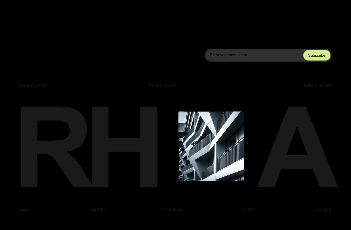
12-a — Wordmark + collaged image. A giant brand wordmark spans the full width at the very bottom, set in a low-contrast tone so it reads as texture. An architectural image is collaged into the gap between the letterforms. An inline newsletter field with an accent-colored button and a row of footer nav links sit above it. Restrained, editorial — best for mono/architecture brands.
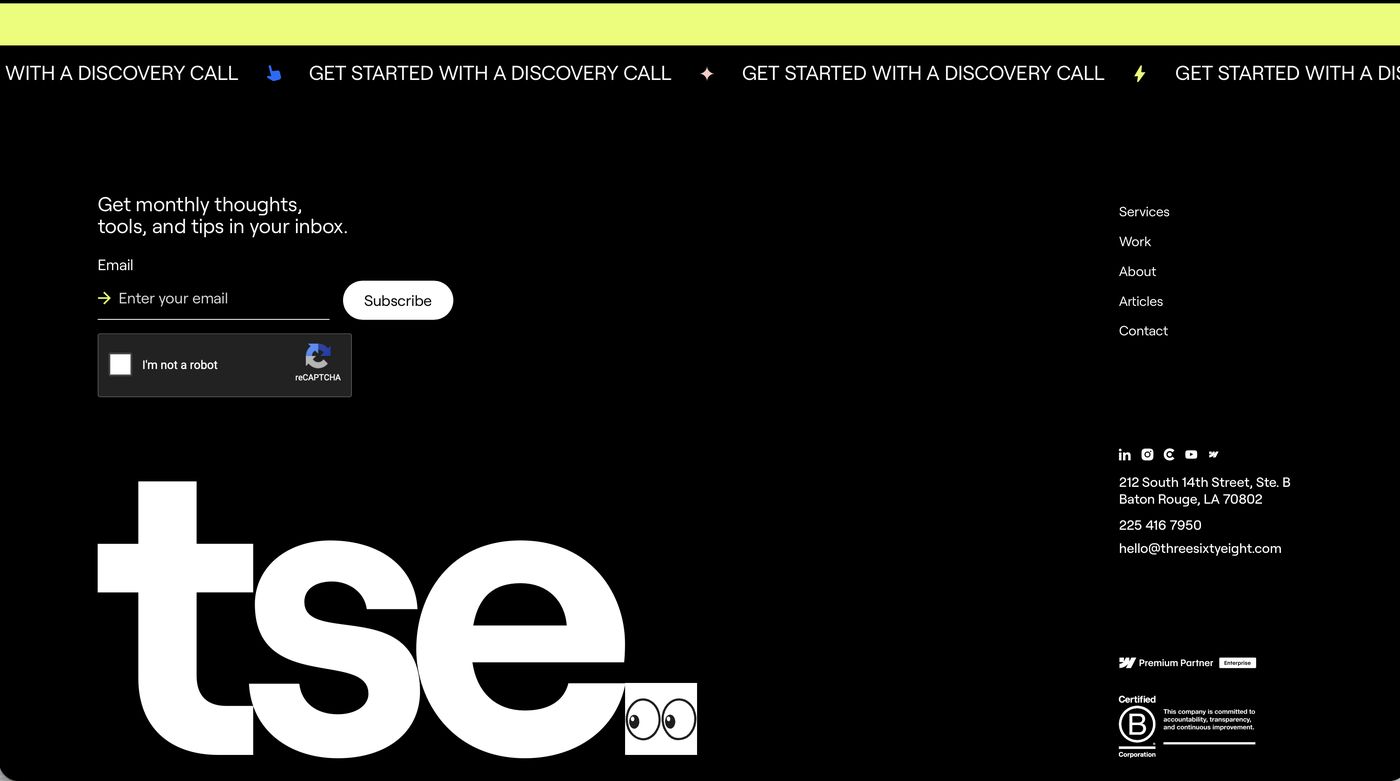
12-b — Kinetic marquee + playful wordmark. A bright kinetic marquee strip runs across the top of the footer repeating the CTA ("Get started with a discovery call"). Below, a giant brand wordmark with a small animated element worked into it — e.g. a box of googly eyes that track side to side as the mouse moves. Newsletter capture, nav column, address, and certification badges fill the rest. The animated detail is the wow — small, witty, memorable.
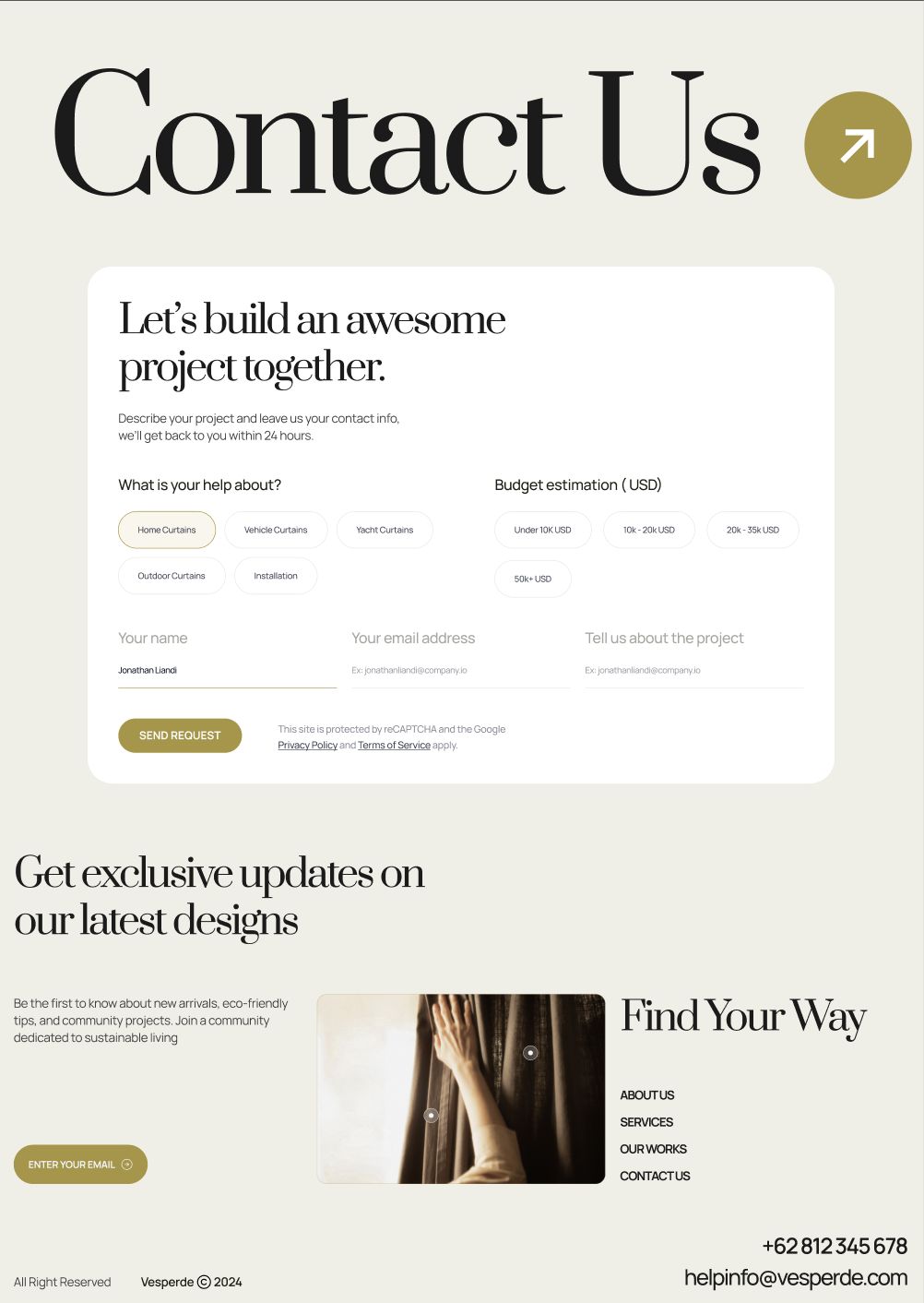
12-c — Footer as a contact form. The footer is the contact form. An oversized serif heading ("Contact Us") with a circular arrow, then a form card with chip selectors (what the inquiry is about, budget range) and clean underlined fields. A second newsletter block and a "Find Your Way" link list follow. Use when the page's whole job is to convert an inquiry — the form earns the space.
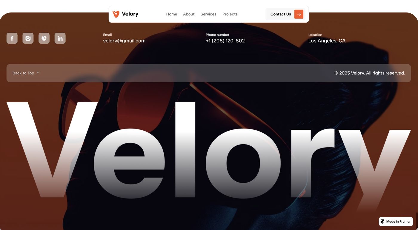
12-d — Full-bleed image footer. A full-bleed dark photograph fills the footer. Contact info sits in a row across the top (email / phone / location); a glass "Back to Top" bar floats over the image; a giant gradient brand wordmark sits across the image at the bottom. Cinematic — best for brands with strong photography.
Deploy when: every build — the footer always closes the funnel. It carries a lighter-commitment reinforcement CTA (newsletter, "book a call," "back to top") after the main CTA section. Match the variant to the brand: 12-a for editorial/mono, 12-b for playful, 12-c when inquiry capture is the goal, 12-d when photography is a strength. Never let the footer become a flat link dump.
Cross-pattern principles
- The footer is a designed moment, not an afterthought — it gets the same craft as
- It always carries a reinforcement CTA: a lower-commitment ask than the main CTA
- Oversized brand type at the very bottom gives the page a confident, resolved
- One wow device is enough — a collaged image, an animated detail, a form, or a
- The footer's palette and type echo the rest of the site — it belongs to the same
the hero.
section above it.
close.
full-bleed photo. Do not stack them.
build.